Saturday 31 August 2013

Audience Research

Potential Audience

Over the last few years the creation of short films has increased this is because of technology which has enabled many people to create films in short amount of time.Short films are not profit- oriented; they are mainly created for the self-promotion of directors, to be entered in film festivals and competitions- they are like a ‘stepping stone’ and to gain experience.

The target audience would effect the content in the film. Feature length films have more potential audiences because they have much more publicity, as the trailers/posters/adverts are shown in various locations such as on television, near cinemas, stations and bus stops the public becomes more aware of them compared to short films which are not normally as heard of. The main reason for this is the budget which is much less than main stream films, as short films are normally 5-10 minutes less money is needed to create them therefore there is also less publicity otherwise more would have to be spent on publicity compared to the actual film. 

Other ways how short films are distributed is through the internet again with due to technology, people from all over the world are able to see short film with sites such as YouTube and the BBC Film Network (some films are also shown on the official websites of the director/creator) and this enables the creator to easily share their work as people of different ages visit these sites. However not many people do search for short films as they are not main stream as do not get as much publicity as feature length films. therefore it would not easily reach target audiences.

The British Board of Film Classification (BBFC) classifies all films in created in the UK. There are six categories where films can be classified into and there are ‘U’ which is suitable for all, ‘PG’- Parental Guidance, ’12’ and ‘12A’- Not suitable for children under the age of 12 however may see the film accompanied with an adult, ’15’, ‘18’ and ‘R18’.

The reason for why films are classified is because of the content- some scenes may disturb/be harmful to different audiences. For example horror film may upset younger children making them unsuitable therefore there would be an age limit so the child must be at least a particular age before they can watch the film. An example for this is Paranormal Activity 3 was rated 15 as it contained strong language and threats which would not suit anyone younger than this age.


The aim for short film relates tends to relate to the purpose if short film. One of the main reasons is for self-promotion. Therefore, the film is aimed at people who go to film festivals and competitions or even talent scouts. As short films are typically used as experimentation for aspiring and established film directors, the audiences would not be as wide as a feature length film. An example of this would be Cherries by Tom Harper. The 15 minute film was about a class of 16 year olds who were being called to the front line. The film would have been shown in schools from year 10 upwards on the issue of a  

But that main reason is for self-promotion as it won an award in the Virgin Short Film festival. However, short films are not always used for self-promotion. Alive In Joburg and Double Take are clear examples

Survey

Analysis of survey results

Thursday 29 August 2013

Production Diary #13

After examining a previous students work I really felt a bit bad for critisising it as he probably spent so long and lots of error and here I am critisisng it. However this was all a learning curve and im 100% that when I complete my short film I will continue to get feedback, a short film is never perfect for everyone. Ofcourse the creator will make it as good as he wants it to look, I guess you could say their own "perfection". Now time to research into audiences.

Tuesday 27 August 2013

Analysis of previous student A2 work

Short Film
Parallel  by Matthew Thomas


Intro
The audience are first introduced to an introduction to the short film. This is to represent the production company of the film, however the design for this intro is completely distracting. In my opinion the intro is cheesy and ruins the introduction of the short film, just by seeing that intro then seeing the short film ruins the experience for me. Also the overall design/theme of the intro I didn't sort of understand, why is the title placed on metal and somethings burning in the corner, it doesn't make sense. However saying that it doesn't have to make sense it's only an intro. In my opinion the production company intro should be a simple black with text.

Concept
We are introduced to a character doing normal daily tasks in his morning day to day life, whilst this is going on we are left with cheesy background music. He goes from multiple stages from waking up, putting his clothes on, making breakfast, eating, getting ready to go out, and when he leaves the door that's when a split screen occurs, this is already half way into the film so it took a while for the film to become engaging. We are introduced to two of the same people however two completely different attitude, on one side one guys in a jacket and smoking and on the other ones in a suit all happy and smiling. Then they come together in a scene as if they are two different people maybe like twins or something. After this split screen is almost always used and we are entered in another clip where there are two different phones, probably one for each character, however the texts seem exactly the same just one is written in slang and one isn't, they both mean the same and in my opinion doesn't make sense. But short films don't have to make sense, that's the beauty of them. Then we a brought to a scene with a table set for i'm guessing the girl in the text. One of the guys girls doesn't turn up and he is the one who set up the table and the other guy's girl arrived and he is lounging on the sofa, then the short ends with a kiss. I mean talk about confusing, lots of things weren't answered and I just didn't understand/like the overall creation, but to be honest I don't have to like it and maybe his short was targeted at someone else and maybe the purpose of his short was to create questions. 

Shot/Cinematography
In my opinion I am a cinematography kind of guy. I love when shots are clean and perfectly shot. Cinematography is a major aspect for me and using a variety of angles. However this students work seems to look like a standard student movie, this is something I want my short film not to have. I want my short film to look professional and as if it wasn't created by a student. This film uses the stereotypical look and shots from any student films, boy wakes up, dresses up, makes breakfast, eats, then that is where the movie kicks off and takes it's own story. Student short films are beginning to have the same look and feel to them all which is starting to bore me and make me shy away from watching student short films.

Edit
The short film was very simply edited. He basically shot the film and then placed all the shorts in the order he wanted to create the short. The only major editing he did was probably creating the introduction and creating the split screen. There was no colour correction and the overall footage looked a bit flat. If there was a bit of work with colour correcting I feel that the film would hold more professional feel and look. 

Sunday 25 August 2013

Thursday 22 August 2013

Film Article Analysis

Magazine: Prevue
Film Review: Did you hear about the Morgans? (2009)
Director: Marc Lawrence

This double page spread was published in Prevue, instantly we can see that the headline for this magazine is the film title, by choosing the title "Did you hear about the Morgans?" it represents what the review will be about and what film, straight to the point.

The overall layout for the review is clear and simple, few pictures and a few images with breakout boxes with breakout paragraphs. By making the main picture large on the double page spread means there will be a considerably less amount of space for writing, therefore this helps to keep the review short and keeps the readers interested unless it is an academic review such as Empire who normally gives in-depth detailed reviews which are still balanced. 

Empire's reviews are completely different compared to Prevue, this is because Prevue gives a short synopsis that doesn't reveal too much of the film, the reviews on Prevue rarely criticize the films, therefore it is not balanced as others would be, this would make the audience go and watch the film this is because of the intended audience. The intended audience would be people who go to the cinema often checking for good films releasing. This is because the language is simple, there is limited information (so it doesn't spoil the film) on the review and it is mainly biased, therefore young people would tend to read this review.

For the house-style, there is a big title in big, bold capital letters. Apart from a few titles, the breakout paragraph and one small breakout box the font remains the same throughout. The colour of the font is different for the main title (to make sure it stands out) and the film information (which is what the audience would need to know whether they read the review or not), the rest of the article has black font.

Production Diary #11

After successfully doing a in-depth post on Film Posters I will now move on to analyzing a double page spread. This is an area which I have a bit more experience with as I read multiple reviews - my favorite magazine have to be Sight&Sound, not only are there reviews at a professional standard but also they write about the honest truth of the movie which is exactly what everyone wants from a review.

Tuesday 20 August 2013

Film Posters

Purpose

Film posters are created for advertising purposes as directors and producers try and get as much of promotion for their films as possible. It is there to show the film in a positive representation. It highlights the stars of film that portray the main characters with their name and the picture of them.

The posters also contains key production unit information such as the director, producer and it contains the distribution information such as when and where it will be released. There are normally a series of posters that are created; these are to attract different audiences.

Types of film posters

Character Poster
Teaser Poster
When a film is ready for release the‘teaser’ posters are released. This shows the audience that the film is soon to come. They give the audience a little knowledge about the film without to giving away too much information, just the general view such as the main stars, director, the genre or the type of film it will be and the age guidance.

There are also 'Character Posters', the posters each have different main characters, these normally have the image of the character, character's name, actor's name, and line or information about the character. The posters are normally quite alike and follow the same structure with each of the important characters from the film. These are created to give a bit of background information about each main character in the film, this helps the cast and crew show what to expect of each character and to understand them better.

Conventions

The main conventions of film posters in terms of technical codes are:
  • The title: These are specially edited/created with special effects to make the font suit the theme of the film.
  • Name of the star/main actor: The main celebrities/main actor present in the film are normally mentioned on the poster.
  • Picture/Image of the star: The main stars have their image as the main attraction on posters, they are shown through their characters
  • Billing Block: This the the information bundled together normally placed at the bottom of the poster, people generally don't read this information however it is what helps to make the poster look like a film poster instead of a general advert
  • Tagline: This is an important element because it give the audience more information about the film. The taglines normally follow a pattern to make it catchy and something the audience is most likely to remember. They can have the 'rule of three', rhyme, a contrast, balance, or repetition.-Background: This has different effects on the audience as some posters are incredibly simple with not much background but with the main stars, however if there is a background it shows other features of the film again giving the audience more knowledge about what the film is about.
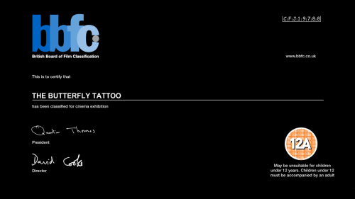
  • Age Certificate: This helps to let the audience know the minimum age it is suitable for therefore about if the content would be suitable for minors.
There are different options available in terms of which ones appear and how they appear because there is certain information that the creators would like the audience to know. For example, the movie poster for the film Avatar had ‘From the makers of Terminator’ therefore as this was a successful box office film it would make the audience the creators are back with another great film so manipulating the audience into thinking to go and see this film as well. You would not see a film that would mention a box office flop film as they are trying to give the film a positive impression on the audience.

Due to technology, even fonts can be utilized to make them suitable for the theme of the film. If there was a new actor who was going to debut in a particular they may not be on the poster as no-one would know who they are therefore there would be no point in placing them on there representing the film. This is the same with Short films which is why on posters there are normally iconic images placed. 

Teaser Posters are more simple as these come out before the main final versions.
The technical codes they have are:

-Actor's Name
-Character's Name
-Character's Image
-A tagline/description associated with the characters
-Simple background which is same for each character


Analysis of Short Film Posters

Short Film posters have a complete different look to their posters, in a sense they look more like a teaser for a Hollywood movie however they poster is actual for a short film. If you think about it short films are just films which are shorter than a full length so you ultimately would also think that it would be the same case with the film poster. Simple & clean.

the kid with a bike


Simple Analysis

I have noticed that most short film posters all have a simple design. In this particular poster there is a main image of the overall concept of the movie being a kid and the title being "the kid with a bike". The main background image has two main colours, red and yellow/pale. The red colour from the t-shirt is also used in some of the text for example the star for ratings and the release date for short, this is mainly to keep the colour theme intact with the overall film poster.

Text which is needed to stand out such as taglines, reviews, awards. White is complete opposite to the red and stands out. However information such as actors name and the billing block is in black as it's not as important compared to the rest of the poster. The title of the short film is simple and doesn't even start with a capital letter, that is one of the major aspects of the film poster, the simple look. Even the title is so simple that it doesn't need a capital letter.

The Mystery of the Flying Kicks


Deep Analysis

The overall design is very clean and basic, however saying that the poster holds power. It makes the audience stop and admire it, with the clean blue background and the main colour being from the main subject of both the poster and the  short film itself (shoes). There is a simple but effective colour theme in this poster, white being standard text, blue being the background of the poster and also being the main title of the short film “Flying Kicks”. Usually the main title is suppose to stand out and been seen easily however this poster breaks the convention and creates a new feel to film posters overall, The title isn't actually a known text, I think that this text was created for this movie, I mean the text itself is a shoe lace which links back to the short films story of being about shoes.

Lace type font which was  probably created specifically for this short film  poster. Illustrates the  concept of the short as a  whole form a simple text. This is the first time I  have ever seen a text which resembles  something instead of just the films title. This grabs the audiences attention as it’s new and unseen of and illustrate in a second what the film will be about.

Simple thin lace to hold to hold stack of shoes; this also demonstrates the overall meaning of the film and what you will accomplish by watching it. What does shoes hanging mean? This was also a  clever way of adding colour to the poster and giving it life which is grab peoples attention.

The poster as a whole defeated multiple conventions however on the other hand it also for- fills the purpose of a film poster. It describes what the film will be about and grabs the viewers attention. However a familiar convention used  is a tagline. It follows the overall poster theme of  being simple and informs the audience the concept of the film.

As you can see all the institution information is kept short and simple which suggests that is the overall theme and look  that they are trying to create with their short film poster. This could link to the overall summary of the short film, as the short is about a simple concept. The poster is simply describing the film in just the poster however the film itself goes in depth. The website and the production company’s logo is included to demonstrate the creators of the movie, a main reason for doing this would be that those who know the production company and enjoy the films they create just being seeing this logo, this will reassure them that the film is worth while. just like their other productions.

Saturday 17 August 2013

Production Diary #10

I have begun to notice that my blog posts have been frequent so yet again I took a few days to relax and rest from blog post, however this is all in preparation for my upcoming post on Film Posters which will be in full detail as this is post will be one of my main sources of research for one of the three main tasks we have to do, not only will this post take me a bit longer than an a day but also will involve a lot of research into different types of film posters and teasers and really give me an insight in the promotion side of films.

Wednesday 14 August 2013

Short FIlm Festivals

Fun creative way to demonstrate a variation of global film festivals, I felt the need to include a paragraph on each festival with their represented logo.

Tuesday 13 August 2013

Sunday 11 August 2013

Evidence of films you admire


When browsing YouTube this short film grabbed my attention in seconds, it could be due to the beauty of the composition,angles/shots or it could be the foreign language and English subtitles which give a depth in the short. The film goes through a young boy wanting to know who's the person in the old photograph, he goes through his whole family asking them the same question and they end up not answering his question and keep doing the activities they were dwelling in, all except his grandma. At the dinner table someones phone goes off and a family relative attack them in a virtual gaming world and she demands the family to attack back! This for me demonstrates the type of photograph we live in today, family time use to be at the dinner table whilst eating however it has evolved to technology being family time. This short will be a huge inspiration for my film and I will always keep watching this film for tips.


Simple but beautiful, this is what I felt about this short. The bright pure colours with the innocent faces of the children just got me in a moment. For me it was unusual the girls asking for a paper airplane as our generation seems to be more dwelled in technology then outdoor activities . This short demonstrates how simple things with your family can be the best time of your childhood and we should never forget that. Family moments like these are ones which will stay in our memory for years, this film demonstrates family as a whole just in a subtle way.


This film for me was all about the concept, if I am honest I did not like the way the short was shot and edited, it just looks like an average student film and it probably could be. However I wanted to take a message about family values and how important it means to people. Even though this film gave a deep topic a comical twist, the impact of the message of family values stood deep to the audiences. Fun and powerful.


Lastly this short was yet again about the subtle message which was created from the short. We see the film as the film creators point of view, all the clips of his family and vacation seem to be in his eyes, however some of the clips he is in so he isn't filming... I mean the short does seem completely acted and stages (Maybe this is on purpose?) however I liked the message of family and the type of downfalls family could come across. Overall the fun message of family issues creates a subtle approach to a deep topic of issue within the family and this short does it perfectly, except the issue isn't that serious.

Saturday 10 August 2013

Production Diary #8

Now that I know what genre I will be following for my short film I can begin to get research which is suited for my short film needs instead of being an overall post of the task. For example my next task is to illustrate films I admire and for this I will only be showing documentary-digital storytelling shorts as I will be able to see the different type of story telling and gain inspiration and it will also keep the blog flowing throughout like a journey, which is the whole point of the A2 Media Studies coursework blog.

Tuesday 6 August 2013

Production Diary #7

So far I think that the latest task was most useful for my short film ideas. I was able to get to grasp with short films and the genres and from this I was able to select one which I thought would be interesting to create whilst at the say time difficult because I love a good challenge. So overall I chose a genre within a genre, something which would be different and stand out from the crowd. I chose a documentary - digital storytelling. Now the question which is going through my question is...

Sunday 4 August 2013

Influences of short film genre & Research into the genre

I created a single prezi for both tasks of genre as I felt that the task as a whole would flow better with a section on the genre as a whole then the chosen genre for my short. 

Friday 2 August 2013

Production Diary #6

Here is a quick social networking I found dedicated to just any type of audio, whether its from podcast to upcoming artists. This social networking allows me to create and include a plug in for an audio clip which I uploaded onto their site.